 +1 (774)478-6704
 Order@premiumonebackdrops.com



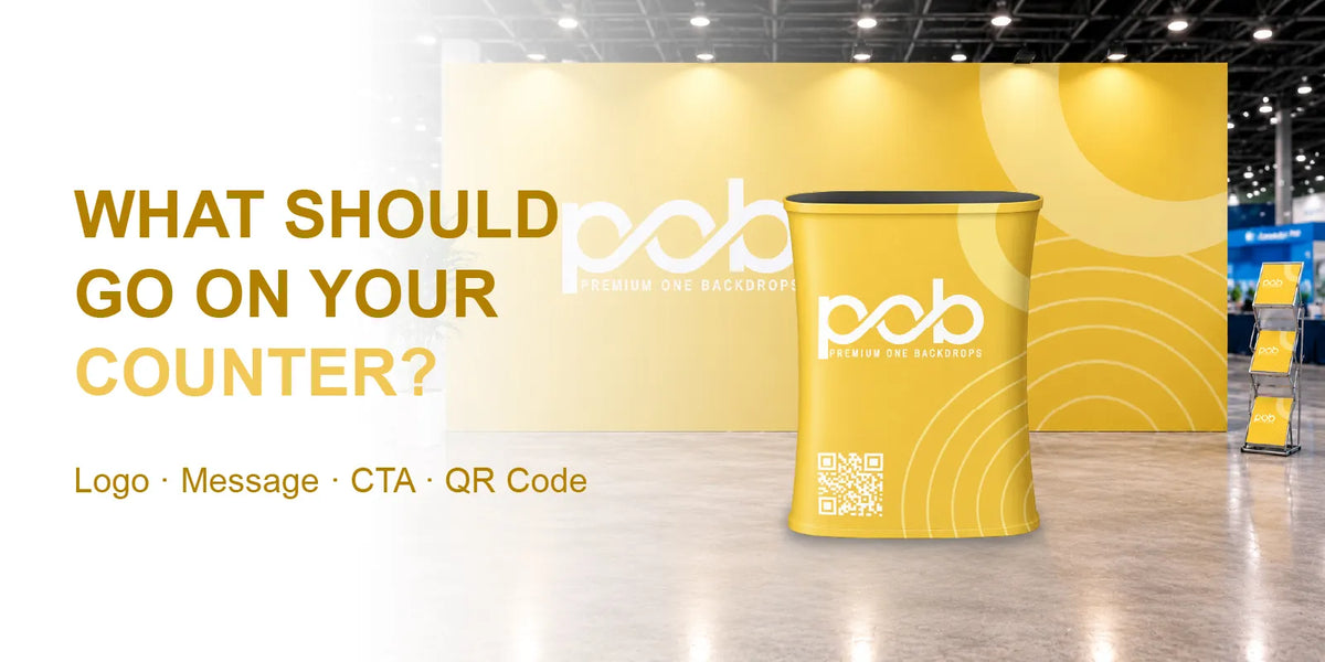
A trade show counter is where visitors often stop to ask questions, view samples, scan a QR code, or speak with your team. Its graphic should support that interaction rather than repeat every message on your backdrop. Before designing, decide what visitors should notice or do at the counter, then build the layout around that single purpose.
A clear logo, a short message, and one relevant next step are often enough. The right combination depends on whether the counter is used for reception, product demonstrations, or lead collection.
Start With the Counter's Purpose
Think about what visitors will do at the counter before choosing the artwork. A reception counter needs clear branding, a product display benefits from one focused visual, and a lead-generation counter should make its next step easy to understand. Avoid trying to fit every product, contact detail, and promotion onto one surface.
You can compare available structures in the Counter & Podium Displays Collection, but finalize the graphic only after selecting the counter model and understanding how it will be used.
Three Counter Graphic Examples
1. Reception: Logo and a Short Brand Message
For a welcome desk, use a prominent logo with a short brand statement, such as “Welcome to [Brand Name]” or “Your Partner in [Industry].” Keep the design simple so visitors can identify the company quickly while speaking with staff. A large product image or several lines of contact information usually adds little when the main purpose is greeting visitors.
2. Product Display: One Product and One Benefit
For a product demonstration, feature one relevant product image and a concise benefit, such as “Built for Easy Event Setup.” If the physical product will sit on the countertop, consider whether another printed product image is necessary. The graphic can instead focus on the product name or one key message that visitors may not notice from the item alone.
3. Lead Collection: One QR Code and a Clear Action
For lead collection, use a short instruction such as “Scan to Request a Quote” or “Scan to View Products,” followed by a QR code that links directly to the relevant page. Test the code on a phone from the position where a visitor would naturally stand. Keep it on a clear background with enough surrounding space, and make sure the destination works on mobile.

Build a Clear Information Hierarchy
Once the counter's purpose is clear, organize the design in order of importance: logo first, main message second, and a supporting visual or call to action only when needed. Not every counter needs all these elements. A reception counter may work with branding alone, while a lead-generation counter may need a logo, a short instruction, and a QR code.
Choose one main action rather than giving equal emphasis to a website address, phone number, email, social handles, and QR code. Visitors should understand what to do without having to compare several competing messages.
Coordinate With the Backdrop Without Copying It
The counter and backdrop should share a consistent brand style, including colors, typography, and logo treatment, but each surface can serve a different purpose. The backdrop may introduce the company or campaign from across the aisle, while the counter gives nearby visitors a more specific message or next step. This also makes a simpler counter graphic easier to reuse at future events.
Adapt the Artwork to the Counter Shape
The counter's shape affects which surface visitors see first and how the graphic wraps around the frame. Do not assume one flat artwork layout will work equally well on every model.
| Counter Shape | Artwork Approach |
|---|---|
| Round | Use wraparound branding and position the main logo toward the primary visitor approach. |
| Oval | Use the main visible face for the logo and short message; keep the curved ends less crowded. |
| Square | Give the front face a clear visual hierarchy and keep important content away from corners. |
| Triangle | Place the main logo or call to action on the face most visible from the aisle. |
If you have not chosen a counter shape yet, read our Round vs. Oval vs. Square vs. Triangle Fabric Counters: Which Shape Fits Your Space? to compare the available shapes and their footprints before finalizing your artwork.

Design Around the Items on the Countertop
Plan the graphic alongside the objects that will sit on the counter, such as a tablet, brochure holder, card reader, sample tray, or product display. These items do not normally cover the fabric panel below the countertop, but a tall display placed near the front edge, an overhanging item, or a separate sign positioned in front of the counter can obstruct part of the graphic.
Check the layout from a visitor's standing position, not only from a straight-on computer mockup. Make sure the logo, message, and QR code remain visible from the expected approach. A simple mockup showing both the graphic and the countertop items can help identify potential obstructions before production.
Check the Template Before Production
Once the design is approved, use the artwork template for the exact counter model and size. Curves, corners, seams, and graphic attachment methods differ between structures, so do not reuse a generic counter file without checking its dimensions and safe areas. Keep important text and QR codes away from seams and edges where the graphic wraps around the frame.
Review the flat artwork and an assembled-product mockup if available. Check spelling, logo placement, QR-code functionality, and the position of any items that will sit on the countertop. For a booth with limited space, our Trade Show Counter Size and Placement Guide for 10×10 Booths can help you plan the counter's position alongside other display elements.
Review the Graphic From the Visitor's Perspective
Before approving the final file, check whether visitors can recognize the logo quickly, understand the main message, and identify the next step without reading several lines of copy. Confirm that the artwork matches the correct template and that the actual booth setup will not block the information that matters. If those details are clear, adding more text is unlikely to improve the design.
Need help preparing your counter artwork? Contact the POB team with your selected counter, intended use, logo, message, QR code, and booth layout. We can help review the graphic arrangement before production.